


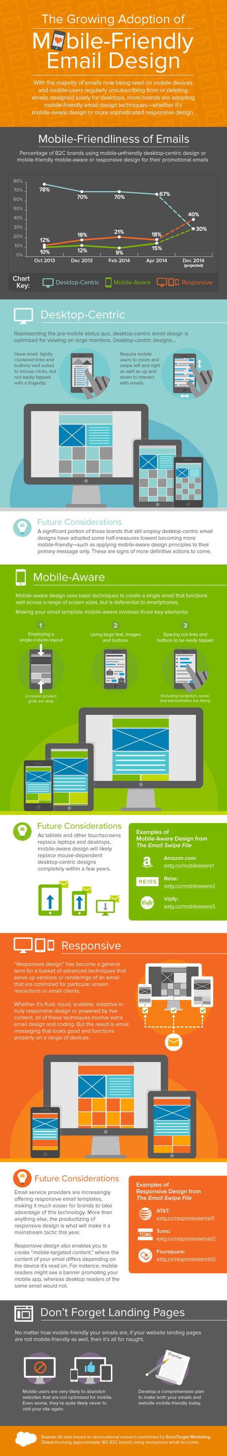

Beyond detailing the adoption rates of mobile-friendly email, this infographic explains the difference between desktop-centric design, mobile-aware design, and responsive design—and the future outlook for each of them. It also includes links to examples of mobile-aware design from Amazon.com, Reiss, and Vizify, and examples of responsive design from AT&T,Toms, and Foursquare from the Email Swipe File on Pinterest.
Via Lauren Moss


 Your new post is loading...


Are you mobile? See how desktop-centric evolve vs. mobile aware design. Very relevant for B2C marketing decision-makers.
Pour les campagnes d'emailing : prévoir un design qui s'adapte à à la lecture de mails sur mobile, sans oublier une landing page à la hauteur !
www.aanve.com