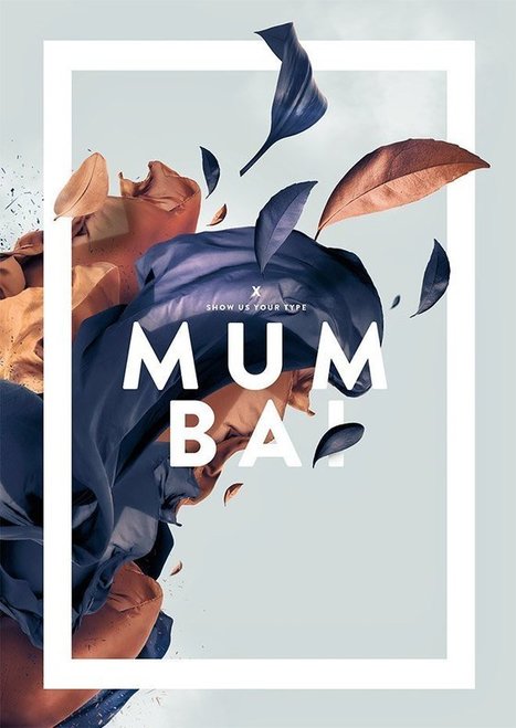
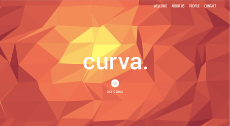
Typography is an important but often under-represented part of a website's layout. With so much focus being placed on the presentational aspects of CSS and the use of large images and media that choke bandwidth restraints; it’s nice to occasionally remember that textual content can also make an impact on users and their experience. Content remains king, and a few good fonts can make even the simplest of sites look smart - though not so many that you have to wait for ages for the text to be visible.
Because of this, I’m going to show you a few handpicked examples of sites that make their content look terrific, and why you should consider following their example in your own work. We’re going to take a journey of how elegant typography can make a site shine; looking at the bold, creative, navigational, simplistic and interactive content that makes the designer's voice speak volumes - so let’s get started!...
Via
Jeff Domansky


 Your new post is loading...


Agree and disagree with some of these trends. The bright colors trend seems obvious, but not when you factor in mobile first. Mobile doesn't handle gradients well thus the great flattening of images into more traditional "web safe" colors. Mobile requires simplification across the board images included.
That is NOT to say arresting images don't matter. Arresting images matter more than every since your content must cut through a mountain of clutter. If you're using standard stock cut luck with that "cutting through the clutter" thing.
Better to find arresting images like the one that got my attention long enough to read and scoop this post :). Marty
Marking basically, implies the way the organization logo and hues have been utilized to depict its picture to the outside world. It engraves the item you offer in the psyches of would be clients. It really implies that when one sees these specific hues and outline logo, the principal thing is to recall your image administrations and items. Letterhead Design Services