Must Design
75.6K views | +2 today
Follow
Must Design
Design Is Revolutionary
Your new post is loading...
Scooped by Martin (Marty) Smith
Scoop.it!

What Waiting Tables Taught Me About Designing Better Websites w/ UX Design

What Waiting Tables Taught Me About Designing Better Websites w/ UX Design | Must Design | Scoop.it
What do waiting tables and UX design have in common? One UX director weighs in on how we can learn how to handle design problems from the physical world.


Martin (Marty) Smith's insight:

Waiting tables is great training for many professions. Waiting, or serving people, teaches many important skills such as listening, being nice and being careful. In this excellent How Design post a UX (User Experience) designer talks about lessons learned waiting tables that help him design better websites.


Michael Allenberg's curator insight, September 4, 2014 8:17 AM

Excellent take on life Experiences... Trust me, I know.

Scooped by Martin (Marty) Smith
Scoop.it!

Bold, Beautiful, Brash Website Designs

Bold, Beautiful, Brash Website Designs | Must Design | Scoop.it
For a while now, designers have been absolutely infatuated with all things subtle. We love subtle patterned backgrounds and intricate decorative elements; we
Martin (Marty) Smith's insight:

Love these bold and brash website designs. Like the Diehl "Forensic Architecture" idea the best. M

No comment yet.
Rescooped by Martin (Marty) Smith from Internet Marketing, Content, Blogging and SEO
Scoop.it!

EYES and How They MOVE Around A Website [infographic]

EYES and How They MOVE Around A Website [infographic] | Must Design | Scoop.it

Engage website visitors better by designing your site to match how people's eyes move on the page. Here are some surprising eye tracking stats to help.


Putting together a great looking website is a great start, but it is just a start.


True web design requires you to venture beyond the aesthetic and into the worlds of User Experience and Conversion Rate Optimization.

Knowing how the viewers of your site really see it can help to shine light on new and/or missed opportunities within your current design. It may also bring out the need for new elements or changes.


While there are plenty of options for improving CRO, eye tracking analysis provides some of the most useful information for optimizing your biggest digital marketing asset, your website.


A good design will catch people’s eye, but a great design will keep people on your site and get them engaged with your content. And while you shouldn’tunderestimate the power of good copy, your design is what people notice first.


We teamed up with our friends over at Single Grain to put together the infographic below in hopes that it will help everyone get a better, basic understanding of what eye tracking is and what it can do.


Via massimo facchinetti, Mike Power
Martin (Marty) Smith's insight:

Eyes move different on a website and this infographic takes you through how to design to maximize HOT ZONES people create by how they view websites.

Gaël Berthier ArdècheTourisme's curator insight, February 19, 2014 4:36 AM
Optimiser l'experience utilisateur et le ROI grâce au eye-tracking
Steve Baker's curator insight, February 19, 2014 7:37 AM

Designing clean, effective websites that work and deliver clients 

Gonzalo Moreno's curator insight, February 22, 2014 6:55 AM

One of my students' favorite topics... XD

Scooped by Martin (Marty) Smith
Scoop.it!

Web design trends for 2014 | Infographic + @ScentTrail Trend Predictions

Web design trends for 2014 | Infographic + @ScentTrail Trend Predictions | Must Design | Scoop.it

What do we predict will be the web design trends in 2014? Here is an infographic with our predictions

Marty Note
Here are my thoughts on web design in 2014.

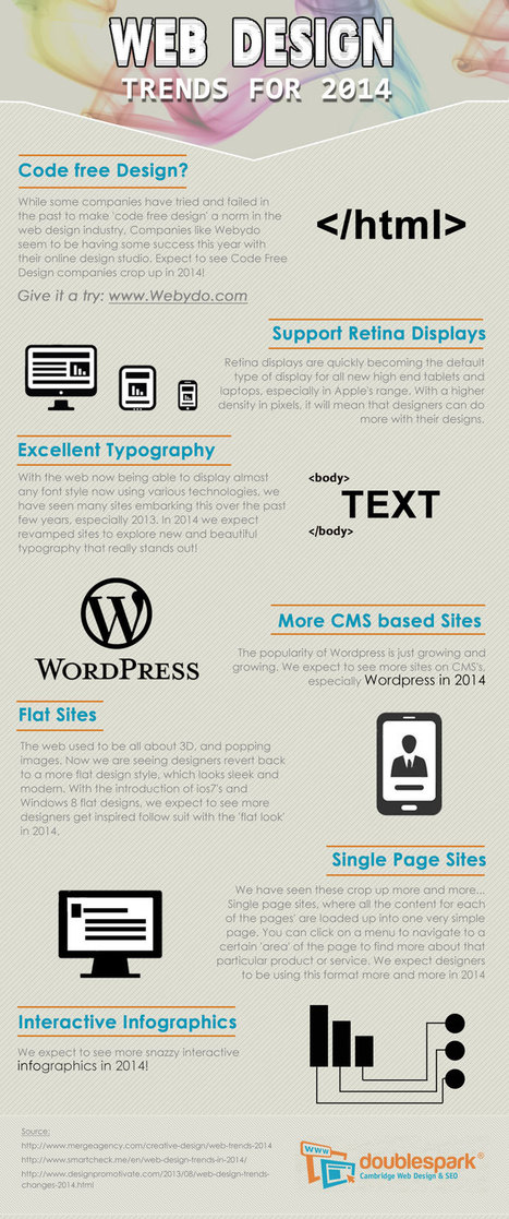
1. Code Free = Disagree, not in 2014, I have tried Webydo and it is as hard to master as code so why bother, until there is a tool that is EASIER than code we will continue to code.

2. More CMS based site - Agree and this is another way of saying more blogs acting like websites. Good idea to read my Websites vs. Blog post on Curatti.com earlier in the week to know how to keep the things that matter from a "website" as your blog fills both shoes: Websites vs. Blogs Which One Is Better and Why http://curatti.com/websites-vs-blogs/ .

3. Single Page Sites - Disagree - I GUESS you could have a robust enough social presence that a single page site would be fine, but you give up a lot and you are asking a single page to accomplish a lot. Google doesn't rank websites they rank web pages, so pagespread (# of pages in Google) can help build traffic via SEO (that is left of it anyway).

A single page website is only viable for strong mobile or social players and somewhere there has to be an engine generating NEW out into the world. If you use a single page, push NEW out and then wipe it clean that is simply CRAZY with the way traffic is parsed and how we gain authority today. Oprah could have a single page site, how an average website could achieve all that is needed with a single page is beyond me.

4. Interactive Infographics - Agree with this one. The Infographic has legs, or should say the idea of visualizing content has legs. The infographic is an expression of a larger movement - our desire to understand things FAST.

Other 2014 Web Design Trends I see include:

* Lean Design - This movement plays off of #4 and the strength of the marketing visualization movement. Creating more understanding faster is a trending trend.

* Social Net Tapestry - Website designs MUST be social and agnostic about social nets. Including Facebook, Twitter, GPlus, YouTube, Scoop.it, StumbleUpon and 10 more I can't think of right now in ways that make sharing easy, rewarding and not overwhelming is a trend no one has figured out all that well yet, but we will begin to see novel ideas that build on the social media  "widget" idea in 2014 (only much better let's hope).

* Content Curation - we must build websites in 2014 that are focused on KEY CONVERSATIONS and become agnostic about where those conversations happen. Own the conversation, own the traffic.


Curating content INTO a website (or blog) is an important trend no one has quite figured out yet either. Start with traditional ORM (Online Reputation Management) tools. Use ORM to crack some APIs so when something relevant happens to your company, brands or products out there in social media's north forty you

  1. Know about it.
  2. Filter it into your content by having ways (filters) to attach curated content into existing themes. 
  3. Gamify contributors so reward is generous, immediate and competitive.


* Appification of Everything - the Mobile Revolution is not about the phone. It is about redesigning our THINKING about how information creates interaction, engagement and conversion (so a small thing lol). Thinking of everything we do online as an app we will be improving is a very "Mobile First" way to think. Those who understand the "Appification" of everything will win BIG as the rest of the world catches up in 2014.

* Gamification - If your website design doesn't find ways to profile, reward and share (curate) content from contributors you will fall hopelessly behind in 2014. The social web is here, despite few understanding the breadth of that that means, and websites need to promote an ever increasing amount of User Generated Content (UGC). Best way to do that is by using game theory to create web design.


No comment yet.
Scooped by Martin (Marty) Smith
Scoop.it!

What is conversation and How can we design for effective conversations?

What is conversation and How can we design for effective conversations? | Must Design | Scoop.it

The social web is about conversation. This is a fascinating post about exactly what is a conversation and how we can design an environ,ent that supports them.

No comment yet.
Scooped by Martin (Marty) Smith
Scoop.it!

5 Jazz Influenced Website Designs

5 Jazz Influenced Website Designs | Must Design | Scoop.it

5 Cool Jazz Website Designs


Hero Roll Static Text

http://www.jetztzeitclub.de/


Love this idea of rolling the hero image while keeping a single textural idea. The impact is to EPHASIZE the text while allowing the visual field to create interest and calm. The problem with heroes that roll and bring new messages is the website can become ADD. You never know where or what to look at. Here the roll reinforces a single message. Cool. 


Color & Texture Shock 

http://www.austynweiner.com/


Same image shift with single text here but an explosion of color and texture. This is an example of going to an extreme to create a sense of visual shock. The only liability with this technique is showing your visitors where to go next FAST since the shock needs to work FOR not AGAINST you. 


Hero with Insert

http://thecarcrush.com/blog/2013/8/y3uaah5ojl6zi4iia95h10iircb8o0


Love the lush images with inserts here. The cars are seductive and romantic, but the insert allows the text and descriptions to add instead of distract from the hero images. 


 Magazine Like

http://boompa.ca/


This waterfall, the infinite scroll, magazine shows how you can build a visual and copy story with large hero images water falling on top of one another. There is real visual organization here. Very cool. 

 
Radically Simple Ecom 

http://www.lushtype.com/


Love tis ide of radical simplicity in ecommerce. Big icons sell icons. By selling one thing the page is easy to understand, easy to buy yet very cool and engaging too. 


No comment yet.
Scooped by Martin (Marty) Smith
Scoop.it!

Museum Websites Inspire Great Design Ideas: Top 10 Art Museum Sites

Museum Websites Inspire Great Design Ideas: Top 10 Art Museum Sites | Must Design | Scoop.it
Could redesigned Web sites be the starchitecture for museums? We pick our favorite museum Web site designs, including the Whitney's kids-only digital playground.
Martin (Marty) Smith's insight:

Steal From These Top 10 Art Museum Websites
FoundObjects.com, now RIP sadly, sold cool gifts to museum stores. Even after leaving the specialty gift business for the B2B web dev agency biz I still use several of the sources I found back then including art museum websites.

This post highlights ten of the best art museum website designs. I agree with most of them especially the Walker in Minneapolis. They rock. When in doubt visit an art museum website such as these ten and #STEALTHIS.

No comment yet.
Scooped by Martin (Marty) Smith
Scoop.it!

10 Basic Tips About Responsive Design - Infographic

10 Basic Tips About Responsive Design - Infographic | Must Design | Scoop.it
Responsive web design could be a specific sort of internet development and design that utilizes CSS3 with fluid proportion-based grids to adapt the layout of a design to viewing setting.
Martin (Marty) Smith's insight:

Great infographic. Don't assume because it is reponsive it is GOOD or EASY (it is neither) and beware SEO complications. 

No comment yet.
Scooped by Martin (Marty) Smith
Scoop.it!

60 Classy Website Designs Inspire

60 Classy Website Designs Inspire | Must Design | Scoop.it
It's quite easy to get stuck in creativity blocks, but it's damn hard to get out of them. Particularly if you are out of time and don't want to compromise your professional principles selecting the first "quick-n-dirty" solution you can think of.
Martin (Marty) Smith's insight:

Refined, elegant and classy website designs from Smashing Magazine. 

No comment yet.
Scooped by Martin (Marty) Smith
Scoop.it!

Designing For GooglePlus: Top 10 Brand Pages on Google+

Designing For GooglePlus: Top 10 Brand Pages on Google+ | Must Design | Scoop.it

We've had a HUGE Day over on GPlus today. I wrote a post about why G+ is magical thinking (https://plus.google.com/102639884404823294558/posts/F5fXyrkTPCr ) and my post got picked up by my friend Mark Traphagen (@MarkTraphagen) and it BLEW up into an amazing conversation.

Given the MONSTER day we've had I thought it would be a great idea to share some of the most successful G+ Brand pages. GPlus is a massive Blue Ocean for most.  Blue Oceans are where your content gets MORE traction with less work. Red Oceans are where your content requires more investment to generate LESS return.

GPlus is really a set of TOOLS. Incorporating Hangouts, maps, communities and other widget-like tools. The first website or agency to figure out how to combine those powerful tools in unique combinations is going to WIN big. Some of these examples approach the top of the mountain, but G+ has more power than even anyone here captures.

No comment yet.
Scooped by Martin (Marty) Smith
Scoop.it!

13 Whitespace in Web Design Examples Inspire

13 Whitespace in Web Design Examples Inspire | Must Design | Scoop.it
There are a many aspects of good web design, and whitespace is certainly one of them. Whitespace is the empty space around design elements such as images, text,
Martin (Marty) Smith's insight:

White space can be the most defining design element of any website. Hard to use well though. Here are 13 examples of how to use whitespace in your website designs.

No comment yet.
Scooped by Martin (Marty) Smith
Scoop.it!

Forbes Sees Big Fonts, FLAT, Mobile, Responsive, Continuous Scrolling For Website Design In 2014

Forbes Sees Big Fonts, FLAT, Mobile, Responsive,  Continuous Scrolling For Website Design In 2014 | Must Design | Scoop.it
It's been about five years since the last redesign of my website, Hitched. A lot has changed since then, most particularly the rise of mobile.
Martin (Marty) Smith's insight:

Don't disagree with any of these 2014 web design trends highlighted by Forbes. 

Lori Wilk's curator insight, December 26, 2013 10:21 PM

The pace of change seems to have gotten even faster over the last year.

Scooped by Martin (Marty) Smith
Scoop.it!

Color Trends 2014

Color Trends 2014 | Must Design | Scoop.it
istock approached creatives from around the world and collected the strongest trends in colour and design: Pantone's Color of the Year and Top 10 Hot or Not.
Martin (Marty) Smith's insight:

Pantone weighs in with hot color trends for 2014. 

No comment yet.
Scooped by Martin (Marty) Smith
Scoop.it!

Top 10 Design Revolution Scoops of All Time

Top 10 Design Revolution Scoops of All Time | Must Design | Scoop.it
Martin (Marty) Smith's insight:

Top 10 Design Revolution Scoops of All Time

http://sco.lt/7FcZ4T Infographic - Color Is Master Of Us All

http://sco.lt/59W02L Blog Post - 20 Web Design Trends In 2013 From Responsive To Storytelling

http://sco.lt/6HpSpF Blog Post - Top 10 B2B Website Designs


http://sco.lt/6gwzxp Blog Post - Learning GREAT Website Design From Websites That Suck


http://sco.lt/8bGgwD Infographic - Latest Trends in Web Design

http://sco.lt/7Dw7ov Blog Post - Pledge Allegiance To The Red, Black and White Website Designs For Inspiration

http://sco.lt/5deXxZ Infographic - The Role of Color in Marketing

http://sco.lt/7MBTaj Infographic - The Complete Guide to Color Psychology

http://sco.lt/6VSW7F Blog Post - 8 UI, UX Tips For Amazing Software or Website Development


http://sco.lt/8CIlEn Blog Post - Roundup of Top 10 Best Websites For Designers - How Magazine

Creating a Scoopit Content Marketing Conversion Study. Learn more: http://sco.lt/69HeAj

No comment yet.
Scooped by Martin (Marty) Smith
Scoop.it!

Web 3.0 Design Inspirations Pinterest Board From @Pupixel

Web 3.0 Design Inspirations Pinterest Board From @Pupixel | Must Design | Scoop.it

Showcase of web 3.0 web sites (html5, css3, parallax, ecc...)

Marty
Great board from @Pupixel (an Italian web designer) sharing examples of web design leading the way to Web 3.0 - a semantic real time web.

No comment yet.
Rescooped by Martin (Marty) Smith from Incion Web Design Blog
Scoop.it!

Responsive Website Design - Must Know Facts

Responsive Website Design - Must Know Facts | Must Design | Scoop.it
Responsive design is a relatively new term in web design. It was only coined three years ago in May of 2010, when web designer Ethan Marcotte used the term.

Via Incion
Martin (Marty) Smith's insight:

There are many reasons to create responsive design. This post shares most of them.

ramil navidad's curator insight, June 17, 2013 3:04 PM

it's all about responsive design now

Adapt or Die 

Scooped by Martin (Marty) Smith
Scoop.it!

22 Red, Red, Red Website Designs Inspire

22 Red, Red, Red Website Designs Inspire | Must Design | Scoop.it
Red is such a powerful colour, it provides emotion and a great emphasis on detail. With a dark, grey colour scheme - red can be used to emphasis text, navigation menu and more.
Martin (Marty) Smith's insight:

Red is a favorite color, but online a little red goes a long way. Red is aggressive, attention getting and stress producing. On the other hand several of these websites show how to use red to conquer, to distinguish and to ROCK. 

Which are your favorites? 

No comment yet.