Your new post is loading...
Content Marketing Is Key
Important post from Scoop.it CEO @Guillaume Decugis because the 12 step program he outlines clearly cleaves content marketing pros from everyone else. We share this post in our Design Revolution Scoop.it feed because we would add 2 more items to a solid list:
13. You aren't designing for content curation and content marketing. 14. You are building community in
Designing for content curation means incorporating the automated feeds Guilluame discusses and leaving room for community and collaboration.
Community's pillars such as user profiles, timeliens, following, comments, wikis and blogging have to be fuilt into a design or you are talking to yourself about yourself even if you follow many of Guillaume edicts. Guillaume's 12 Step Progam: 1. You’re not tracking your results. 2. You’re not repurposing your content. 3. You aren’t automating at least part of your social media activity. 4. You aren’t automating some of your email marketing. 5. You’re only sharing your own content – you’re not adding any content curation to the mix. 6. You aren’t testing. 7. You don’t have a content strategy that’s tied to business goals and your buyers’ journey. 8. You haven’t defined your buyers’ personas or their typical journey. 9. You aren’t creating content strategically. 10. You don’t have a centralized “vault” of all your company’s content assets. 11. You aren’t promoting your content, either via social sharing or by making it visible to the search engines. 12. You have nothing to show for your work.
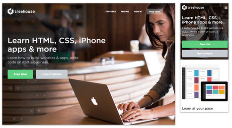
Learning From Video Game Designers
Video game designers can teach you a lot about how to great great ecommerce and B2B websites. Video games are gamified, social and understand the stimulus - response nature of online interaction in a fluid and must imitate ways.
Here are WhatCulture.com's picks for the 20 best video game websites in the world. We like Gamers With Jobs and Kotaku (though we don't understand a lot of it).
Web Design Jazz is the conversational alchemy that is website design riffing important conversations your brands have with visitors and potential customers. What about you? What conversations are your having with customers? How did you get there?
Check out our Web Design Jazz video and join the conversation:
http://www.curagami.com/master-classes/web-design-jazz/
We're boiling down 13 of the most prominent web design trends emerging in 2015. Will they change your understanding of a "modern website"? You be the judge.
Marty (@Scenttrail) Notes:
1. Make it big (Agree but not as easy to do well as they make it look). 2. The multimedia experience (agree and same as #1) 3. The Parallax effect mutations (Horizontal Scrolling) Agree 4. Animated storybook (Agree and cool). 5. Flat design (agree & effect of mobile) 6. No more boxes (Agree and YES!). 7. Tiles (Pinterest effect and agree). 8. Navigation widgets (Agree!) 9. Integrating Google maps (Agree where appropriate). 10. Mashup interfaces (AGREE grab those APIs :). 11. Minimize (Seems to contradict #1, but agree). 12. World Wide Wait (speed is going to be KEY). 13. Designer automation (Agree, can do a lot with templates now).
Knowing your website's navigational taxonomy can mean the difference between millions in traffic and money. Here are 5 Simple Navigational Taxonomy Rules.
* It's About THEM not YOU.
* Create A Commons.
* It's FREE and EASY. * Srart with Brands & Work OUT. * Find Engagement & Work IN.
Easy to follow rules so your site's nav WINS traffic, hearts, minds, SEO and loyalty needed to be around for a bit.
When I think of responsive web design I think of Transformers: Websites in Disguise. With one set of code you can build a website layout that runs flexibly...
Marty Note
Yesterday we shared thoughts on the marketing side of responsive web design along with some design basics. Responsive design creates a flexible membrane adapting itself to any receiving device.
Creating responsive design is INVOLVED. You can trash your SEO (Search Engine Marketing) without really knowing it, confuse your web designers and customers and do more damage than good.
I like this Jake Rocheleau "ultimate guide' because its a natural part 2 to yesterday's responsive basics (http://sco.lt/4ob6DR ). Responsive design is a MUST, but, as you will agree after reading Jake's Ultimate Guide, not to be undertaken lightly or without some reading about what is happening under the covers.
Great job by Jake and V
5 Must Knows BEFORE You Design A Website
Team Curagami (http://www.Curagami.com ) has, over the course of our combined careers, helped thousands of clients build websites and about 99% have cart before the proverbial horse. "What is our design going to look like," they ask.
Most think "web design" is creating the look and feel of a site. Actually the look and feel, while important, is at least #6 on the "do these things to create a great web presence" list. Here are the first 5 things on that list:
1. Elevator Pitch - Who Are You?
If we were riding in an elevator could you explain your business before we reached your floor? If NO is your answer you are not alone and you need to go back to the drawing board and practice until you have your "elevator pitch" down. All things flow from that defining snippet.
Tags can help define your elevator pitch. Curagami.com Cool Tools For Ecommerce Merchants explains what we do in 5 words. Note that I don't have the the site yet so do as we are saying not as we do (always :).
2. Pain Point - Whose Your Tribe?
We create stuff to DO SOMETHING. Your product or service must help some tribe. Curagami helps ecommerce merchants understand content marketing because finding the balance beam between content that works and content that hurts is a CSF (Critical Success Factor) for ecommerce merchants. So our tribe begins with ecom merchants and we address the PAIN of understanding content marketing. We don't LIMIT ourselves. We don't say, "Go away" to B2B SaaS clients but they are cream on the top of our core tribe and mission.
3. UCA - What Are Your Customers' Aspirations
Unique Customer Aspirations is a metrics we developed as Marketing Director for Atlantic BT. UCA speaks to the transformation your content, product and service creates. Yes Curagami helps merchants make more money, but we also relieve the STRESS of not knowing what to do and why. We help merchants have confidence in their content. No one can build sustainable online community (everyone's master goal whether they know it or not) without being confident in their ability to create, share and curate content. Content is king online and the implications of that statement go far and wide. It's not enough to know your tribes shape you must know their CHARACTER too. Our tribe is STRESSED OVERWHELMED and WORRIED. Anything we do to relieve any of that makes our content sticky and sure to be shared.
4. Know Difference Between Content CREATION and CURATION
Being able to create content is important. We suggest our clients create about 10% of content from unique brand based strings. 90% of the content we want clients to share, discuss and riff off of comes from gurus, customers and THE OTHER. The other is anyone other than you and keeping tabs on your category information, knowing what matters most to your readers and why and understanding the need to tuck ego in back pocket and share competitive information is one of the hardest skills we teach. Web marketing is MOSTLY about THEM not YOU so knowing when you need to blog vs. when you need to comment is key.
5. Know Social Marketing Basics
I'm staying at The Blackwell Inn in Ohio while being treated at Ohio State's James Cancer Center. I've tweeted several positive comments @theBlackwell. Noneof those comments have been ReTweeted and they don't follow me.
ERROR.
My social following dwarfs theirs so breaking the FOLLOW BACK rule hurts 'em. By not picking up my @tweets they discourage such shares and lose the value of that communication (that they actually LISTEN and CARE). I think they do listen and care, but they don't have the skills to do so ONLINE. Before you create a website you need to know what's up in social media.
The Blackwell's lackof knowledge isn't fatal since they are located on Ohio State's campus and are the ONLY such hotel so located. They can SUCK at social media (for a bit) without pain. Doubtful your website, especially if it brand spanking new can afford such a deficit.
Since the master goal of your site is the creation of sustainable online community NOT understanding the implied contracts and un-stated ways social media works can be DEADLY.
Know those 5 things and we can begin to discuss wireframes, look and feel and visual marketing :). Marty
One More Thing - reason this stuff is so important, as my friend Frank Pollock would explain, is the web is a lie detecting amplifier. If you lie it will be shared with the world and known instantly or before, so don't lie. If you are CONFUSED, as many SMBs are, get STRAIGHT before you put crayon to paper and design a site or risk having your confusion being your main message.
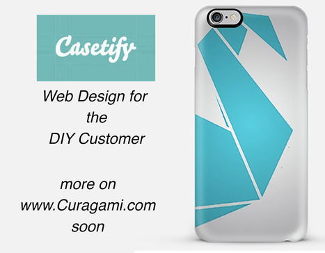
*Web Design For DIY*
The Do-It-Yourself revolution is blowing up thanks to mobile apps and social media. This link includes one of our favorite examples: http://www.Casetify.com where we just created our http://www.Curagami.com logo case for iPhone 6Plus.
We are working on a series of posts about how to engage and empower your DIY customers & you can help. Send ideas, comments and your experiences with DIY marketing and we will curate into the piece with attribution and a link (martin (at) curagami.com).
Find more DIY Marketing thoughts and a secret code you can use to get $10 off your Casetify.com creations (8PGZX3). Sharing a code like that is powerful brand ambassador fuel.
Share your DIY tips and check out more notes on GPlus:
https://plus.google.com/102639884404823294558/posts/Nezb4QZgayx
An updated look at the hottest best web design trends of 2014 including a showcase of modern web design inspiration.
Marty Note
This @justcreative post hit many nails on the head when it was initially published and Jacob's update of Helga Moreno's post doesn't disappoint either. Things I REALLY agree with:
See Less of (PLEASE):
* Stock photography (no photos? ASK your employees / followers for help but please no more Stepford people in pics on websites).
* Flash (has killed more #seo and sites than you can shake a stick at and fact it is still alive is amazing).
* Capcha - spam sucks but so do capcha forms.
More of PLEASE:
* Content First (implied in Responsive or Mobile First Design is a new way of thinking about, tagging and presenting content).
* Interactive Exploring (BIG AGREEMENT see my post about Time is Money Online https://plus.google.com/+MartinWSmith/posts/RdjAjWoJTHw and tag this next to #gamification).
* Arresting pictures and Video (YES, your great content will be ignored or under-shared UNLESS it is paired with strong visual hooks and supports).
Great post by Helga for Just Creative and so TRUE to our experience of web dev in 2014 for leading ecommerce clients such as Moon Audio.com.
If you were to ask me what’s the best way to showcase your creativity, then I would definitely say that it is in designing a website.
Marty Note
I love the "behind the scenes" honesty and accuracy of this Smashing Magazine post. Smashing Magazine is a trusted source for me and this post is true to my experience of creating hundreds of websites and helping Curagami.com clients to create thousands more.
The article I was looking for was how to design for constant change, for the smaller iterations we take now. If you now of a post like that please share. If I can't find it after more searching I will just write it since it feels like content marketing and web design have changed.
Content marketing is about QDF now (discussed recently here: http://www.curagami.com/featured/how-quality-deserves-freshness-changes-content-marketing/
If you have insight or resources that help explain how to design a web environment for maximum flexibility and an ease with the constant change we labor within these days please share. Thanks, Marty
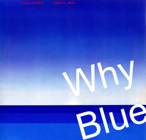
Marty Note
I LOVE Blue as a web design color. When I was a senior at Vassar I painted a common room in Main the blues of Keith Jarret's album Arbor Zena (in image). Took a week, but the room shared some of the same reasons I love blue for web designs.
5 Reason Blue Rocks Web Design
* Sends trust, strength, grace and beauty signals. * Easy to manipulate ( shades of blue work online see LoewyDesigns). * Works as accent or background.
* Images pop off of blue nicely.
* There are many text and font options with blue.
Here are my 3 favorites from the examples:
* LoewyDesigns (shades of blue).
* Black Sea Fisheries (for way blue caries type and fonts). * Z-Index.it - for how calming blue can be to chaotic multiple image Pinterest-like heroes
Jenny Odell is a gifted artist, web designer, writer. The icon page in the Red Bulletin with a tiny name was intriguing enough to prompt a Google search. The Red Bull Bulletin is one of my favorite publications.
The Bulletin is visually stunning but that's not all. The Odell page is a great example of the intelligent and very NOW sensibility Red Bull's Bulletin uses with such grace.
To intrigue, take advantage of how the world is not how it was and engage is so important in today's social / mobile / connected world. Red Bull's publication and core branding GETS IT.
The Jenny Odell page of tiny icons such as the Eiffel Tower, Spiral Jetty and squiggly lines requires WORK to see and decipher. Work to find out what the page is al about. Red Bull GETS that their customers are connected so they build in hooks to those capabilities.
Brilliant marketing I wrote about for Curatti in Red Bull's Branding Lessons: Why We Are All Media Companies Now:
http://curatti.com/red-bulls-branding-lesson-media-companies-now/
Jenny Odell's site
http://www.jennyodell.com/
We asked several developers what their favorite sources are for web design and code inspiration, and they pointed to these 17 wide-ranging sites.
Marty Note
I like several of these designs including Web Design Ledger and The Source for their creative balance between images, copy and headlines. There are so many things dancing on the head of a pin on any homepage such as:
* Your desire to SHARE everything. * Their (visitor's) desire to find what they want. * Navigation.
* Images.
* Headlines & Copy.
Getting all of these dancers to tell a coherent story in 9 seconds is the challenge. Usually as content being shared increases understand decreases. Several of these designs manage to present a lot of options intelligently.
Which one is your fav?
|
5 Super Secret Marketing Trends
One of the "Super Secret" Marketing Trends we see for 2016 is Nowism. As defined brilliantly in a TED Talk by Joi Ito (embedded in the post) Nowist plan less and react more. Nowist look to the web to provide the collaborative means to react to what is happening now.
Nowism brings several important design considerations including:
* Incorporation of Social Media Feeds * More space for Content Curation * More flexibility and less rigid and static boxes * More movement and change throughout a site
When something BIG happens and a web design looks and feels the same the sit steps away from the now. One of http://www.Moon-Audio.com major partners is about to launch an earth shatteing new product.
Moon's site needs to have the ability to curate, create and spin content about this innovation fast and furious. The more your content marketing and website live in the now the stronger its relationship with your customers.
See the other 4 Super Secret Marketing Trends for 2016 here:
http://www.curagami.com/5-super-secret-marketing-trends/?v=7516fd43adaa
Designing a good website that accommodates a lot of content is a tricky balancing act to pull off. Does one attempt to present the user with all the information
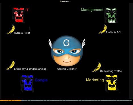
17,162 People Later
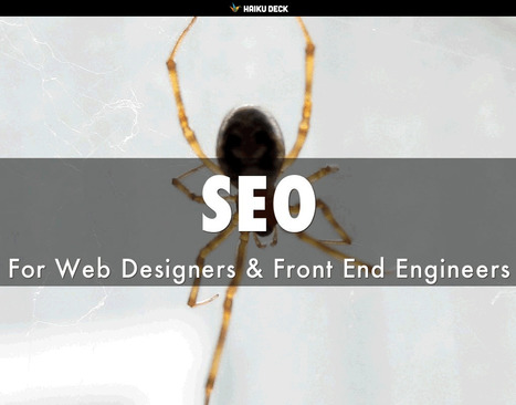
We've been asked to make the presentation that created our most viewed Hiaku Deck again at the Iron Yard Code Academy again (made the first presentation six months ago). There were important ideas we shared last time:
* SEO THRIVES or DIES with graphic designers. * Graphic designers are heroes under siege by many groups. * Set REALISTIC expectations.
* Set reasonable boundaries (with gorillas looking for bananas).
* Shared a few easy to remember tips to help designers improve their technical SEO skills.
Obviously we hit a nerve. We will be updating benchmarks shared six months ago to see how those we mentioned fared since. Remember technical SEO is important, but your content must engage, be exciting (visually too) and develop sustainable online community to win over time.
Good luck and if you have SEO questions we didn't cover email them to martin(at)Curagami.com and we will include and send you a Curagami Rules tee.
Web designers shouldn't be SEO experts since keeping up with DESIGN is a full-time job. Nothing has made that truth more apparent than my first week learning CSS, SCSS and the like at The Iron Yard Code Academy in Durham, NC this week.
But web designers are where SEO rubber meets the Google Road so understanding a handful of ideas is critical to the online success of any designers creations. This deck was created to share with The Iron Yard's Cohort 3 Front End Engineering class Friday January 16th.
Includes our favorite FREE SEO tools and how we use them. Good luck and let us know your SEO / Design experience and we will curate into an upcoming post on http://www.curagami.com.
Explore the top web designing trends for 2015. The infographic discusses the top 6 predictions that are set to rule the web designing world in 2015.
Responsive web design is the practice of creating websites that display evenly on all devices. Understand the basics of responsive web design with examples.
Marty Note
Don't make the common mistake of thinking responsive design is all about look and feel. Yes some WordPress templates can make it FEEL that way since they are built to accordian with different receptions created by phone, laptop and computers.
The important idea for marketers to understand is to THINK Mobile First. Thinking mobile first brings a slew of changes such as:
* Flat web design.
* Limited Colors.
* Less functionality that is easier to understand.
* Content snippets instead of novels.
* Emphasis on VISUAL MARKETING.
* Need to make content & communication feel & act like a game.
Those last bullets speak to the gamification of marketing so implied by smartphones and a mobile / social / connected world. Mobile means never having to say you're sorry because you listen and curate more than you talk, create sustaining community and engagement and understand all the implications of "the network is the computer".
Just shared an overview of Marketing Timelines on G+ (https://plus.google.com/102639884404823294558/posts/EkXN57uJyjq ). All that said, you still need to understand Responsive Design 101 so appreciate this Scoop.it suggestion from @David Fournier. .
Web Design Basics
Love these five web design basics:
* Learn TYPE Design.
* Pick Great Fonts That Fit Your TONE.
* Pick 3 Color Palette & STICK TO IT.
* Photos = RIGHT SIZE.
* When In Doubt, Give It SPACE.
This last tip is our favorite. Nothing we hate more than claustrophobic web design. Problem is claustrophobia is easy to create. We all WANT to do so much.
When I was an Ecommerce Director we studied our links carefully. We found that 5% of our links received 90% of the clicks. That equation turned out to be a fractal. No matter how small we cut it, no matter how we shifted the design, a small % of the links dominated.
This means MOST of what WE, as designers, think is important isn't. We learned to be Google - Vicious about what we added. Adding meant something had to COME OFF the design. This strange User Interface math means you have more ROOM than you realize.
Find what matters and LINK IT. Design what matters and eliminate the flotsam and jetsam so you have SPACE around what matters since it is that SPACE that signals IMPORTANCE to your visitors. .
Marty Note
Watching the excellent HBO Documentary about James Brown Mr. Dynamite made me think of FUNK and web design. Web design is easy to get WRONG (lol).
It is tricky to design online with a sense of surprise, beauty and novelty. I like the Digital Invaders design as it feels free and spontaneous. Other designs such as Monster CSS and Creative With A K feel like they are trying to appear spontaneous and free.
Trying too hard is EASY in web design too. Remember all websites are STAGES we designers SET. The trick is to set a stage that feels like it is happening now and won't feel dated tomorrow. Feels like there are enough visual hooks in Digital Invaders it would be easy to keep it fresh with minimum fuss.
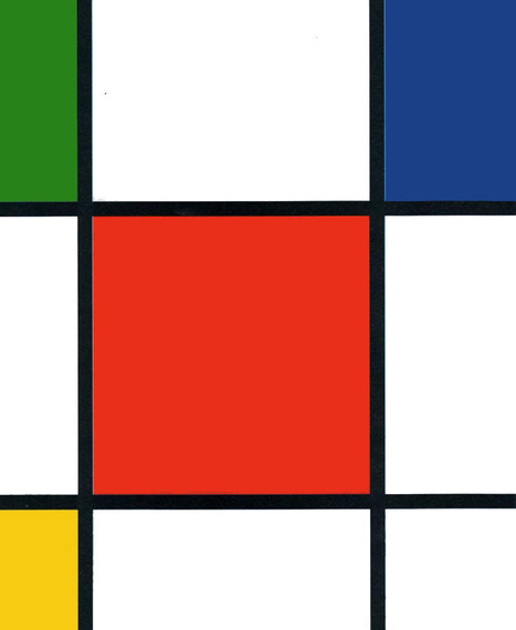
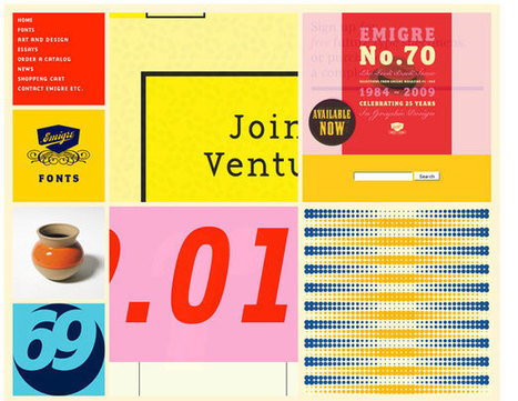
I like Emigre too. Emigre creates the same sense of happening now but that design is at the other end of the spectrum from Digital Invaders. Its hard to beat the grid. First website I created, in 1999, used a Mondrian grid.
Grids help organize massive amounts of information without that mountain feeling like it is about to crush you. I like the funky NOISE contrasted to the quiet grid because they demonstrate the need to find a visual VOICE in your web design. That voice can be anything as long as it feels authentic TO YOU.
The web is very good at finding and amplifying DISSONANCE. When you try to FUNK IT UP and aren't really funky it shows like you are wearing the wrong decades fashion (painful). Your customers are your audience.Set the stage anyway you want, but do so with an eye toward YOUR TRUTH.
The closer you stay on the tiny beam of "authentically us" the more success your web design has. This is why there are no web design maxims that apply all the time. What works for Emigre is very different than Digital Invaders but both work, both are authentic and have that hard to describe but know it when you see it TRUTH great web design must have.
Social Mobile Web Blowing Up Web Design
The boxy unidirectional web design controlled by wireframes (boxes within boxes) is gone. The social mobile web is crushing, spinning and recreating web design as we write this sentence.
Don't let old "web design thinking" enslave. Help create a revolution in web design by sharing your favorite story of website PAIN. Every shopper, web designer or marketer has a favorite Website PAIN story.
SHARE YOUR STORY to help change the story :).M
http://www.curagami.com/featured/burn-your-website-down/
Best Black & White Web Designs
Color is a tough master. Color sends many conscious and unconscious messages. Some websites strike out to create beauty with a simple palette.
Using only black and white these web designs show how powerful those two colors can be. Favorites include Sofa and Marck Ecko.
Responsive Web Designs
Responsive design, forming a website's information so it looks great on any device, is becoming mission critical. Here are 65 of the best responsive designs in 2014 via SocialDriver.com.
Japanese web designer Yugo Nakamura has created some cool sites. Great clean lines, white backgrounds, splashing of color, movement both real and implied reminds me of Haring, Warhol and de Kooning. #toogood #webdesgin
|


![Web Design Trends 2015 [Infographic] | Must Design | Scoop.it](https://img.scoop.it/L41KKlVHAbH6NFwnMzAQbDl72eJkfbmt4t8yenImKBVvK0kTmF0xjctABnaLJIm9)


![Burn Down Your Website via @Curagami [& Share Your Web Pain Story] | Must Design | Scoop.it](https://img.scoop.it/wYZ47r2tXnou2lD-EhG2WDl72eJkfbmt4t8yenImKBVvK0kTmF0xjctABnaLJIm9)