Your new post is loading...
Content Marketing Is Key
Important post from Scoop.it CEO @Guillaume Decugis because the 12 step program he outlines clearly cleaves content marketing pros from everyone else. We share this post in our Design Revolution Scoop.it feed because we would add 2 more items to a solid list:
13. You aren't designing for content curation and content marketing. 14. You are building community in
Designing for content curation means incorporating the automated feeds Guilluame discusses and leaving room for community and collaboration.
Community's pillars such as user profiles, timeliens, following, comments, wikis and blogging have to be fuilt into a design or you are talking to yourself about yourself even if you follow many of Guillaume edicts. Guillaume's 12 Step Progam: 1. You’re not tracking your results. 2. You’re not repurposing your content. 3. You aren’t automating at least part of your social media activity. 4. You aren’t automating some of your email marketing. 5. You’re only sharing your own content – you’re not adding any content curation to the mix. 6. You aren’t testing. 7. You don’t have a content strategy that’s tied to business goals and your buyers’ journey. 8. You haven’t defined your buyers’ personas or their typical journey. 9. You aren’t creating content strategically. 10. You don’t have a centralized “vault” of all your company’s content assets. 11. You aren’t promoting your content, either via social sharing or by making it visible to the search engines. 12. You have nothing to show for your work.
Designing a good website that accommodates a lot of content is a tricky balancing act to pull off. Does one attempt to present the user with all the information
Knowing your website's navigational taxonomy can mean the difference between millions in traffic and money. Here are 5 Simple Navigational Taxonomy Rules.
* It's About THEM not YOU.
* Create A Commons.
* It's FREE and EASY. * Srart with Brands & Work OUT. * Find Engagement & Work IN.
Easy to follow rules so your site's nav WINS traffic, hearts, minds, SEO and loyalty needed to be around for a bit.
If you were to ask me what’s the best way to showcase your creativity, then I would definitely say that it is in designing a website.
Marty Note
I love the "behind the scenes" honesty and accuracy of this Smashing Magazine post. Smashing Magazine is a trusted source for me and this post is true to my experience of creating hundreds of websites and helping Curagami.com clients to create thousands more.
The article I was looking for was how to design for constant change, for the smaller iterations we take now. If you now of a post like that please share. If I can't find it after more searching I will just write it since it feels like content marketing and web design have changed.
Content marketing is about QDF now (discussed recently here: http://www.curagami.com/featured/how-quality-deserves-freshness-changes-content-marketing/
If you have insight or resources that help explain how to design a web environment for maximum flexibility and an ease with the constant change we labor within these days please share. Thanks, Marty
We asked several developers what their favorite sources are for web design and code inspiration, and they pointed to these 17 wide-ranging sites.
Marty Note
I like several of these designs including Web Design Ledger and The Source for their creative balance between images, copy and headlines. There are so many things dancing on the head of a pin on any homepage such as:
* Your desire to SHARE everything. * Their (visitor's) desire to find what they want. * Navigation.
* Images.
* Headlines & Copy.
Getting all of these dancers to tell a coherent story in 9 seconds is the challenge. Usually as content being shared increases understand decreases. Several of these designs manage to present a lot of options intelligently.
Which one is your fav?
How strong is your content marketing strategy? What is SEO, anyway? Read 6 SEO tips and tricks to help you boost the visibility of your web content.
1. Strong Copy Trumps SEO.
2. Do Keyword Research.
3. Share Link Love (i.e. create great content).
Marty Note
Interesting to see how How Design explains SEO to graphic designers. I would take a slightly different tack. Let's reframe SEO in ways graphic designers can understand and adapt.
I create content daily and am learning SLOWLY how to make headlines sing and links flow in. As competition for links goes UP with the rising tide of content publishers are the right side of the bell curve where more than average links reside will learn a few tricks from graphic designers such as:
* ARRESTING Images.
* Demand hierarchy.
* Clear Calls To Action (CTAs).
* Headlines that GRAB and HOLD.
Content that doesn't get read doesn't help. The first rule of getting your content read is find an ARRESTING related image you won't get sued to use. Haiku Deck (http://www.haikudeck.com) is one of my favorite visual marketing tools. Need lawsuit free arresting images? Use Haiku Deck.
Demand Hierarchy is keeping demands on your visitors LOW. When I was a Director of Ecommerce we did extensive analysis of our 40+ homepage links and 5 mattered. Vicious 90%/10% rule in links. Key is to lower choice and eliminate the superfluous.
CTAs don't have to be "buy now" anymore. We love asking a question with the link between the present page and the answer. Want To Be A Great Internet Marketer? Highlight and underline that sentence and it will get clicked because it is an IMPLIED CTA.
This doesn't mean we are above a good "Learn More", but too many "old style" CTAs can get boring and lose their punch.
Finally your HEADLINE or subheads matter. Headlines should set a hook. Subheads should organize the answer so readers can scan and skip sections. I try to live by the 7 word rule.
I read this rule about roadside billboards. Billboard creators limit their copy to 7 words because who can read more zipping buy at 60 mph. We all zip by at 100 mph on the web these days so short, punchy headlines that align with your arresting image and plant a hook work best.
We like KEYWORDS, Brands and questions in headlines too. Questions create curiosity. Keywords create scenttrail and brands create comfort and "like me" feelings of trust and security.
Designing G+ In
Crazy to suggest using G+ as a tool to power your online marketing right? Maybe not. Greatest return always comes from the least understood ideas. GooglePlus is a "least understood" idea these days.
Their leader left and TechCrunch said G+ the social net is dead. They may be right, but that is beside the point. G+ has always been more than a social net. G+ is a suite of tools marketers can use to find blue oceans.
Blue oceans are the as yet unspoiled places where marketers can still swim without fear of a herd of sharks. Oceans where sharks eat themselves are "red oceans" such as Facebook.
We suggest designing G+ into your marketing and site. Hold weekly hangouts, you don't need a G+ profile to use hangouts now, and created a branded community if only so you rule your name in #seo. Finally we suggest curating the great comments you will receive on G+ as a source of future content.
We've never been able to figure out how to use circles in a unique way, but they too beckon with possibility. By creating weekly content based on Hangouts and Community you get lots of GoogleJuice, the least expensive #videomarketing we know about and great community development tools that cost you NOTHING.
The linked post discusses Mark Traphagen's call to use G+ as a hub of your marketing. That's a great call since the price is RIGHT (free though you may spend some making G+ play the way you want it in your design). Designing G+ tools INTO your community creates the cheapest, biggest and best online win we can think of.
So the death of G+ is greatly exaggerated and, if you are smart, you will find a way to design the tool's many possibilities into your marketing.
"I spent a lifetime learning to draw like a child." Picasso
This is an interesting post from Thomas King about the complex nature of simplicity. Picasso's point about spending a lifetime learning to draw like a child seems important for web designers too.
The hardest thing to do is do less. The hardest mind to recover is the exploratory mind, the mind before judgement. When we recover the playful mind, the simple easily rewarding routine of play, our designs run free like Picasso's bull.
The Bauhaus ethic applied principles such as "honesty of construction", "truth to ma...
Awesome Responsive Design Website Designs for Inspiration. Selection of Awwwards winning Responsive Design websites. Fluid grids, flexible images and media queries are the three technical ingredients for responsive web design
Last week, Jeremy Osborn, Academic Director for Aquent Gymnasium, had the chance to attend the Artifact Conference. Here are his key takeaways.
Marty Note
This Artifact Conference looks interesting and worth checkout out (http://artifactconf.com/ ). I love this quote from the Responsive panel at the conference in Providence, RI:
"On the other hand, responsive design is forcing companies to prioritize site performance. The consensus is that slow-loading and bloated sites are just as much of a “design” flaw as confusing layout, clashing colors, and the rampant proliferation of typefaces on page. "
Most designers focus on how to accordion a website so it looks good on any device. The real challenge is deeper. How do we architect "less bloat"? How do we design information to be lean and responsive?
Couple of things I've noticed include:
* Building stories via visuals and rich snippets.
* Taking advantage of the swipe and spin options on mobile devices.
* Creating easier to understand backend functionality.
* Using a LEAN or MEAN filter forcing messaging to get to the point FAST.
The SEO and engagement benefits of the second half of responsive design - the information architecture half - are enormous. We know that as engagement goes up so do our site's heuristics and the "new Google" loves more time on site, lower bounce rates and other "engagement metrics".
The "Responsive Challenge" for designers is to realize more is involved than look and feel. The very core of our communication must be reviewed, reevaluated and changed to be leander and more responsive too or we design dissonance in. Confused customers do many things converting is never one of them.
Marty Note
Have you seen those commercials promising to build a website, host it and get it "listed" with search engines for $19.95 a month? Love those ads.
I have 30,000,000 reasons why I know they are BS. That is the amount of money my excellent fighter pilot Internet marketers raked from the Internet over seven years I was Director of Ecommerce. It was NEVER easy, uncompetitive or a tall cold drink in the shade.
This time of year we didn't sleep much and the rest of the year we were setting up for this time of year. No rest for the weary and no website that matters for $19.95 UNLESS you are Oprah or Penn or Teller or a football player or Justin Bieber.
You see it right? If you have a SUBSTANTIAL engine developed offline in some other way or media you can live with a one page website built to convert the heck out of your efforts elsewhere. Some mobile plays MAY be able to get by with so little too.
The problem with the mobile boys is they ONLY think mobile and they have the same problem as outlined above. The market has to START somewhere. The market you start has to be NURTURED somewhere. Without content, community and campaigns you can't capture, arm and convert the brand advocates needed to scale.
Throw one of these one page sites in front of the bulls my old marketing team could get to run and it would be swept from the field into permanent irrelevance, so use this idea ONLY when you are just converting traffic already primed by some other effort.
|
Learning From Video Game Designers
Video game designers can teach you a lot about how to great great ecommerce and B2B websites. Video games are gamified, social and understand the stimulus - response nature of online interaction in a fluid and must imitate ways.
Here are WhatCulture.com's picks for the 20 best video game websites in the world. We like Gamers With Jobs and Kotaku (though we don't understand a lot of it).
Web Designer SEO
Our SEO Tips for Web Designers hit a nerve. It is heading to 13,000 views (probably today). We hit a nerve because web Designers are where SEO rubber meets the road. This Haiku Deck is full of SEO tips for web designer including:
* Know who has the banana and why.
* Know how much SEO you need to know. * Learn what is MIST vs what is Gorilla.
* Listen Digitally.
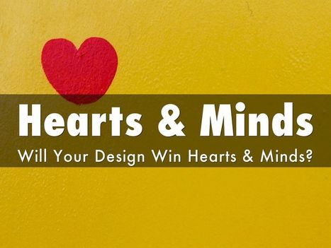
* Understand how SEO & Content marketing work together. * Design to Win Hearts, Minds and Loyalty.
And More SEO tips designed for designers.
An updated look at the hottest best web design trends of 2014 including a showcase of modern web design inspiration.
Marty Note
This @justcreative post hit many nails on the head when it was initially published and Jacob's update of Helga Moreno's post doesn't disappoint either. Things I REALLY agree with:
See Less of (PLEASE):
* Stock photography (no photos? ASK your employees / followers for help but please no more Stepford people in pics on websites).
* Flash (has killed more #seo and sites than you can shake a stick at and fact it is still alive is amazing).
* Capcha - spam sucks but so do capcha forms.
More of PLEASE:
* Content First (implied in Responsive or Mobile First Design is a new way of thinking about, tagging and presenting content).
* Interactive Exploring (BIG AGREEMENT see my post about Time is Money Online https://plus.google.com/+MartinWSmith/posts/RdjAjWoJTHw and tag this next to #gamification).
* Arresting pictures and Video (YES, your great content will be ignored or under-shared UNLESS it is paired with strong visual hooks and supports).
Great post by Helga for Just Creative and so TRUE to our experience of web dev in 2014 for leading ecommerce clients such as Moon Audio.com.
Jenny Odell is a gifted artist, web designer, writer. The icon page in the Red Bulletin with a tiny name was intriguing enough to prompt a Google search. The Red Bull Bulletin is one of my favorite publications.
The Bulletin is visually stunning but that's not all. The Odell page is a great example of the intelligent and very NOW sensibility Red Bull's Bulletin uses with such grace.
To intrigue, take advantage of how the world is not how it was and engage is so important in today's social / mobile / connected world. Red Bull's publication and core branding GETS IT.
The Jenny Odell page of tiny icons such as the Eiffel Tower, Spiral Jetty and squiggly lines requires WORK to see and decipher. Work to find out what the page is al about. Red Bull GETS that their customers are connected so they build in hooks to those capabilities.
Brilliant marketing I wrote about for Curatti in Red Bull's Branding Lessons: Why We Are All Media Companies Now:
http://curatti.com/red-bulls-branding-lesson-media-companies-now/
Jenny Odell's site
http://www.jennyodell.com/
PicassoHead App
Sharing this cool "draw a "Picasso Head" app (my PicassoHead http://www.picassohead.com/?id=5290a28#.VBCfth1bqjo.twitter ) to illustrate a few of our favorite web design concepts such as:
* DO LESS and let them DO MORE (them = customers, visitors, advocates_.
* GALLERIES ROCK - especially when your gallery is chock a block full of User Generated Content (UGC).
* Engagement Rocks - do you have a tool that is fun to use AND promotes positive site heuristics such as time on site, pages viewed, lower bounce?
* Every product, idea or website starts about the creators and must become about those who visit and love it.
* People love what THEY create and contribute more than what you do.
* This means all web design is or will be about collaboration.
We love the simplicity of this little app, but the even COOLER riff came from our confirming email. This is the email that shares the link where my Picasso At The Beach drawing lives (linked from this post http://www.picassohead.com/?id=5290a28#.VBCSuy4Lksk.twitter ) and where this little pitch lived:
"This summer check out Picasso Looks at Degas at the Clark in Williamstown, MA. You won’t want to miss this groundbreaking, Clark-exclusive exhibition that is the first to look at Pablo Picasso’s deep fascination with Edgar Degas.
http://www.clarkart.edu/exhibitions/picasso-degas/ "
Wow, cool idea. Create a little art based app and sell related links in the confirmation email. That's brilliant marketing, subtle marketing and the art of web design. Kudos to Picassohead creators RFI Studios, http://www.rfistudios.com. #toogood
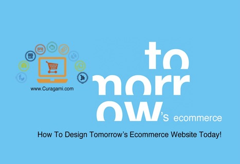
Designing Tomorrow's Ecommerce
I'm writing a blog post for Curatti that will go live at midnight tonight that discusses the "best practices" of "Tomorrow's Ecommerce". I'm also writing a Curagami blog post (also published at midnight) about how social shopping will change Tomorrow's Ecommerce.
Tomorrow's Ecom Current Best Practices (Curatti tonight)
Tomorrow's Ecom Social & Mobile Web (on Curagami now)
The Haiku Deck that bridges both of these posts is linked above and here:
http://shar.es/1nkJef
As we publish each post we will link them here.
Pageless design frees websites from the outdated conventions of print design and fully utilizes the digital platform they’re built on.
8 Compelling Reasons Why "Pageless' Web Design Wins (in the end):
* Tells a better story. * Easier to "digest" or understand what to do. * Emotionally more powerful. * Higher Conversion Rates!!!
* Makes updating faster & easier. * Lowers BOUNCE & encourages sharing. * Looks great on all devices (mobile included). * Lower cost to develop.
Marty Note
I confess to not being in love with the "infinite scroll" just yet. One modification we worked out for @Curagami, our Startup Factory funded startup, is to include a Call-To-Action at the top & Bottom.
CTAs help prepare the scroll. Remember "open book" tests? Putting a CTA on top of a waterfall of content helps prep a visitors mind. It "opens the book" for them. With this many impressive benefits I'm going to have to figure out how to start loving "pageless" design (lol).
I bet there are 5 (or so) similar modifications we can make to help us know how to create the paths and conversion we want by going "pageless".
We've had a HUGE Day over on GPlus today. I wrote a post about why G+ is magical thinking (https://plus.google.com/102639884404823294558/posts/F5fXyrkTPCr ) and my post got picked up by my friend Mark Traphagen (@MarkTraphagen) and it BLEW up into an amazing conversation.
Given the MONSTER day we've had I thought it would be a great idea to share some of the most successful G+ Brand pages. GPlus is a massive Blue Ocean for most. Blue Oceans are where your content gets MORE traction with less work. Red Oceans are where your content requires more investment to generate LESS return.
GPlus is really a set of TOOLS. Incorporating Hangouts, maps, communities and other widget-like tools. The first website or agency to figure out how to combine those powerful tools in unique combinations is going to WIN big. Some of these examples approach the top of the mountain, but G+ has more power than even anyone here captures.
There are many of content heavy websites out there, but very few seem to take good design into account. We take a look at those that do.
Marty Note
Content can KILL a website design. Content needs to be well thought out. How can you tease the click without frustrating your visitors and readers? How can you share all the content you need to share without wrecking your design? Here are 25 examples of how to use content as a helpful design element instead of ending up on content's rocky shores.
Yesterday an article on Medium, Snowfallen, caught my eye. It's about a technique for presenting longform writing online, by embellishing it with integrated
What do we predict will be the web design trends in 2014? Here is an infographic with our predictions
Marty Note
Here are my thoughts on web design in 2014.
1. Code Free = Disagree, not in 2014, I have tried Webydo and it is as hard to master as code so why bother, until there is a tool that is EASIER than code we will continue to code.
2. More CMS based site - Agree and this is another way of saying more blogs acting like websites. Good idea to read my Websites vs. Blog post on Curatti.com earlier in the week to know how to keep the things that matter from a "website" as your blog fills both shoes: Websites vs. Blogs Which One Is Better and Why http://curatti.com/websites-vs-blogs/ .
3. Single Page Sites - Disagree - I GUESS you could have a robust enough social presence that a single page site would be fine, but you give up a lot and you are asking a single page to accomplish a lot. Google doesn't rank websites they rank web pages, so pagespread (# of pages in Google) can help build traffic via SEO (that is left of it anyway).
A single page website is only viable for strong mobile or social players and somewhere there has to be an engine generating NEW out into the world. If you use a single page, push NEW out and then wipe it clean that is simply CRAZY with the way traffic is parsed and how we gain authority today. Oprah could have a single page site, how an average website could achieve all that is needed with a single page is beyond me.
4. Interactive Infographics - Agree with this one. The Infographic has legs, or should say the idea of visualizing content has legs. The infographic is an expression of a larger movement - our desire to understand things FAST.
Other 2014 Web Design Trends I see include:
* Lean Design - This movement plays off of #4 and the strength of the marketing visualization movement. Creating more understanding faster is a trending trend.
* Social Net Tapestry - Website designs MUST be social and agnostic about social nets. Including Facebook, Twitter, GPlus, YouTube, Scoop.it, StumbleUpon and 10 more I can't think of right now in ways that make sharing easy, rewarding and not overwhelming is a trend no one has figured out all that well yet, but we will begin to see novel ideas that build on the social media "widget" idea in 2014 (only much better let's hope).
* Content Curation - we must build websites in 2014 that are focused on KEY CONVERSATIONS and become agnostic about where those conversations happen. Own the conversation, own the traffic.
Curating content INTO a website (or blog) is an important trend no one has quite figured out yet either. Start with traditional ORM (Online Reputation Management) tools. Use ORM to crack some APIs so when something relevant happens to your company, brands or products out there in social media's north forty you
- Know about it.
- Filter it into your content by having ways (filters) to attach curated content into existing themes.
- Gamify contributors so reward is generous, immediate and competitive.
* Appification of Everything - the Mobile Revolution is not about the phone. It is about redesigning our THINKING about how information creates interaction, engagement and conversion (so a small thing lol). Thinking of everything we do online as an app we will be improving is a very "Mobile First" way to think. Those who understand the "Appification" of everything will win BIG as the rest of the world catches up in 2014.
* Gamification - If your website design doesn't find ways to profile, reward and share (curate) content from contributors you will fall hopelessly behind in 2014. The social web is here, despite few understanding the breadth of that that means, and websites need to promote an ever increasing amount of User Generated Content (UGC). Best way to do that is by using game theory to create web design.
|


![15 Best Responsive Design Websites | Web Design Inspiration [@PeterShamN is Great] | Must Design | Scoop.it](https://img.scoop.it/8aFuuxRsqzsrJbqggGQEMzl72eJkfbmt4t8yenImKBVvK0kTmF0xjctABnaLJIm9)