

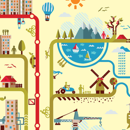
Sometimes, as the old saying goes, pictures really do tell 1000 words. And if that’s the case, what’s better than a picture with 1000 words included on it?
Get Started for FREE
Sign up with Facebook Sign up with X
I don't have a Facebook or a X account


 Your new post is loading... Your new post is loading...
Sometimes, as the old saying goes, pictures really do tell 1000 words. And if that’s the case, what’s better than a picture with 1000 words included on it? 
No comment yet.
Sign up to comment
10 Reasons Visual Content will Dominate 2014 What marketing strategies will we focus on in 2014? What will we leave behind? This article takes a look at the rise of visual content - and why 2014 will dominate in 2014: 1. 90% of information transmitted to the brain is visual. Visuals are processed 60,000X faster in the brain than text.
Martin (Marty) Smith's insight:
I can think of a few more reasons visual marketing will dominate in 2014 including: * Mobile LOVES visuals and everything is going mobile * Visual marketing is more viral, more "shareable".
Grat Monica S Mcfeeters Comment: This is one of the best reasons for art education. A visually or media illiterate citizen or consumer is very apt to be manipulated or make unwise choices. From Wikipedia: Visual literacy includes in addition the ability to understand visual forms of communication such as body language, pictures, maps, and video.Evolving definitions of literacy often include all the symbol systems relevant to a particular community. Literacy encompasses a complex set of abilities to understand and use the dominant symbol systems of a culture for personal and community development. In a technological society, the concept of literacy is expanding to include the media and electronic text, in addition to reading and writing.

Lynn Pineda's curator insight,
March 14, 2014 11:25 PM
All I can say, is thank goodness for Visuals in content! I've always been a visual person being a visual learner. Information is easier to retain and comprehend when visuals are employed as it pulls you in. The article's statistics further supports the importance of visuals. I love visuals! 
Carlos Bisbal's curator insight,
March 16, 2014 10:15 AM
10 Razones por las que los contenidos visuales dominarán el 2014
¿En qué estrategias de marketing nos vamos a centrar en el 2014? ¿Qué vamos a dejar atrás?
Este artículo echa un vistazo al ascenso del contenido visual y por qué 2014 será el año de los elementos visuales. .
From
neomam

What does the Infographic Revolution mean for your website design efforts? * Get to the point. 3. Some combination of 1 and 2.
From
infogr
1. Pick a design you like 2. Add your data 3. Share or embed infographic
***** Been looking for an auto-infographics tool. Marty Via Baiba Svenca, Ann Vega
|

From
circos
How To Succeed Visually * Learning Curve Protects The Niche WHEN You Get In.
We asked Randy Krum, Founder and President of InfoNewt, an infographic
Martin (Marty) Smith's insight:
Don't be fooled by infographic naysayers. Yes there are BAD infographics, yet when I tracked the top 10 for my 125,000 views on Scoopit Infographics owned more than half of almost every feed's top 10. Translation - we need to create infographics and other forms of data visualization.

Tyler Richendollar's curator insight,
March 6, 2014 10:30 AM
If 8 tips weren't enough, here are 3 more.

From
visual
See which colors, typefaces and styles come together to form the logos of the world's 100 most powerful brands.
Martin (Marty) Smith's insight:
Blue, Red and Balck dominate colors and sans serifs dominate fonts. This infographic goes great with Color Is Masters of us All infographic: http://sco.lt/7FcZ4T
This piece was posted by Loren Sorenson for Hubspot, I selected it because as she says "If you aren’t prepared for the visual content revolution, you may be left in the dust.
Not convinced? Let's take a look at exactly how visual contentis positively contributing to marketing strategies -- it may just give you the push you need
"Learn why visual content is a critical part of your content creation strategy.
Here are some highlights:
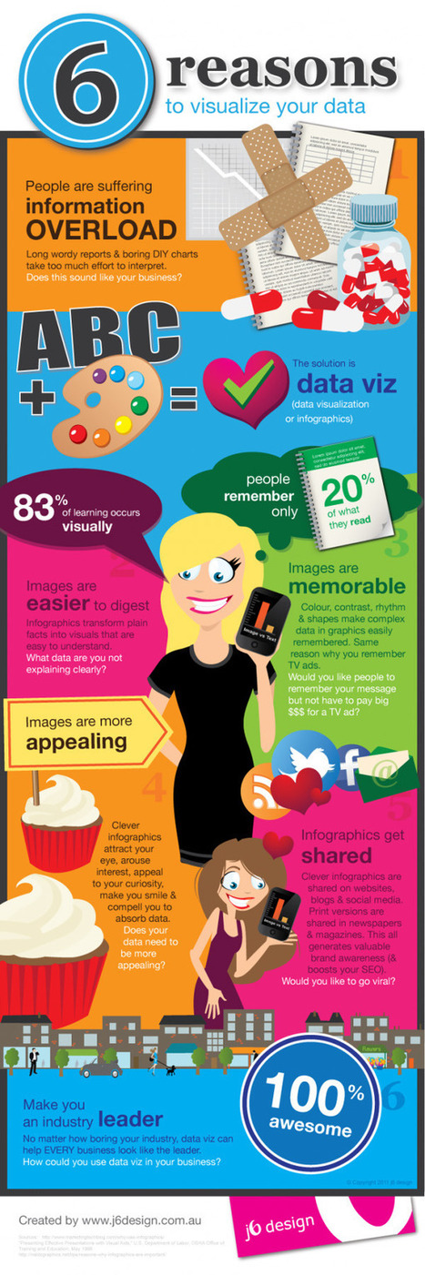
**People remember only 20% of what they read
**83% of learning is visual
Condenses and Explains Large Amounts of Information
**Today, there is too much information on the Internet you have about 3 seconds to catch someone’s eyes so they'll consume your information.
Gives Your Brand an Identity
**Visual content draws people in, letting viewers better understand your brand's identity
Drives User Engagement
**If you've ever read a book with a child, you probably know they find pictures more interesting than words; but are adults really that different?
Selected by Jan Gordon covering "Content Curation, Social Business and Beyond"
Read full article here: [http://bit.ly/Ifujbp] Via janlgordon

janlgordon's comment,
April 11, 2012 3:21 PM
Beth Kanter
Thank you for adding me to the wiki and for your kind words, it's greatly appreciated. Yes this is the conversation of the moment so to speak. I'm sure your presentation was amazing. Would love to hear it if you have a replay. 
Beth Kanter's comment,
April 11, 2012 10:08 PM
Jan: There's a link in the wiki to the live stream of the session - and a lot of notes and resources ... I love this topic! I'm holding myself back from created another scoop.it on it ...
janlgordon's comment,
April 13, 2012 10:05 PM
Beth Kanter
Thanks for looking forward to seeing this info. Knowing you, I can imagine that you want to start another scoopit on this topic but it's not necessary because you're already doing a wonderful job covering it now. |


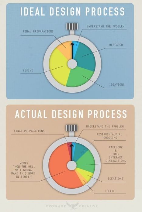
Love these especially the ideal vs actual. So true. M